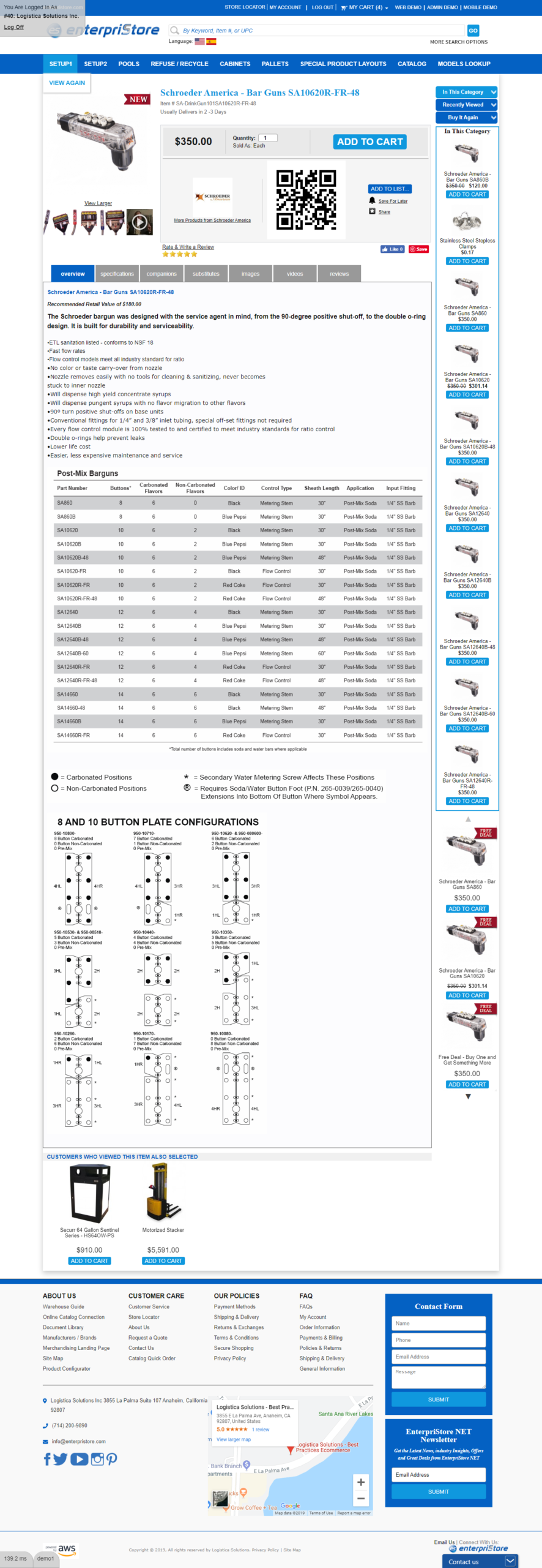
At an ecommerce site, it’s important to make it as easy as possible for customers to find the information they want and to place orders. For this reason, EnterpriStore has designed a product page layout that flows in an intuitive, natural way and that’s easy for customers to access. At the top of each page is the basic product information: product title, product ID, any special message you want to include, price, discounted price, discount rate, and a quantity box. Right beneath this information, customers will find buttons for all the actions they may want to take. They can quickly add the product to their cart, add it to their wishlist, add it to a shopping list, email someone the page, print the page, and send in a question about the product. The easier you make it for a customer to purchase a product, the more likely you are to see an increase in your sales.
Beneath these actions, customers can find more detailed product information. All of this information is included in a single box with tabs, maximizing the amount of information without taking up too much space or creating a cluttered page. You can choose to include tabs for product overview, specifications, reviews, videos, accessories, and extra photos. In this way, customers who want more information can easily find what they’re looking for, while keeping a streamlined page layout.
In addition, around the outside of the page the customer will find recommendations for more products. They’ll see scrollers for their own recent history and a selection of products that other customers selected. Along the side, they’ll see other products in the same category and products they may like (similar products in related categories). There is also a quick box for customer service, making it easy for them to contact you at any time.