
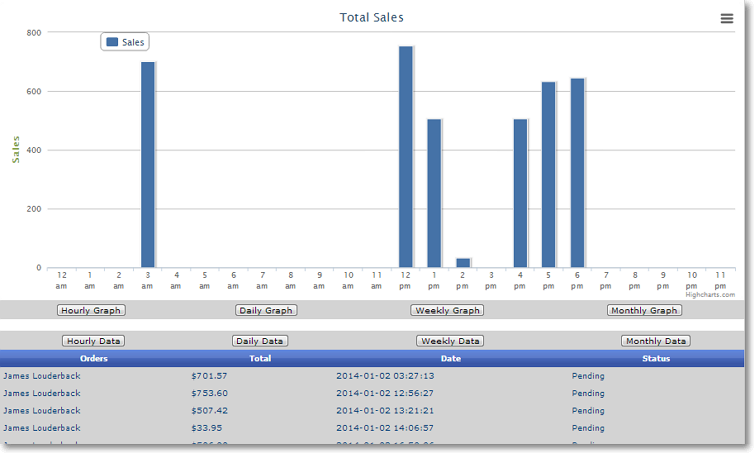
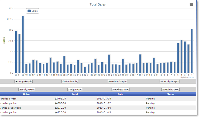
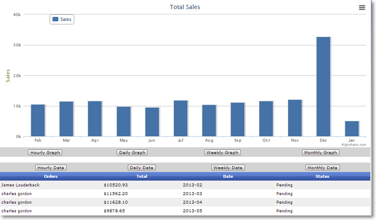


Information is key to the success of any business, particularly of ecommerce stores. You need to be able to track how your website is performing and how your sales are progressing. EnterpriStore provides you with detailed graphs in every possible category to make sure that you have the comprehensive data you need to make smart, informed decisions. The first graph, and probably the one you’ll check most frequently, is sales performance. EnterpriStore provides graphs for hourly, daily, weekly, and monthly sales performance so that you can look at both the details and the big picture. This information is displayed as a simple bar graph, with further detailed data in a chart below. In the data chart, you can see information about individual orders during any time period.
EnterpriStore also generates pie charts to help you easily see the patterns in your sales. You can view graphs for your top categories and your top products, organized by day, week, or month. The pie chart means that you can gain the big-picture information with a quick glance. The graphs are also labeled with individual category and product names, as well as the percentage of your sales they made up. This makes it fast to get the detailed information you need.
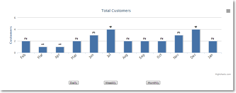
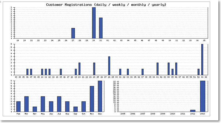
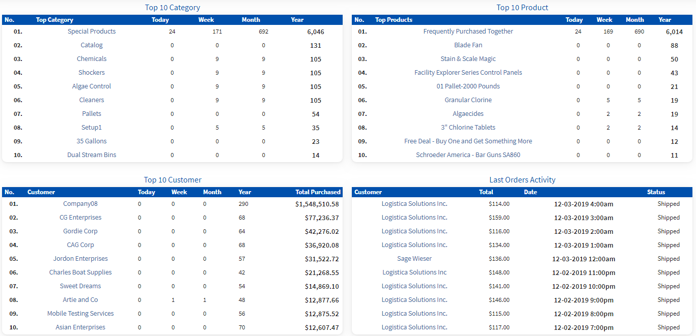
Additional graphs will show you your total customers and total orders daily, weekly, and monthly. You can see new customer registrations by the day, week, month, or year. To help you track performance patterns, you’ll also find a graph for orders by day of the week and by hour of the day. In addition, there’s a graph for the number of orders per day and average order size. These graphs will help you to get an understanding of your customers’ purchasing habits so that you can make better business decisions. As a final touch, EnterpriStore generates lists of your top ten customers, categories, and products. No matter what information you need, you’ll find it in an easy-to-read graph or chart, so you always have the right business intelligence.